.png)
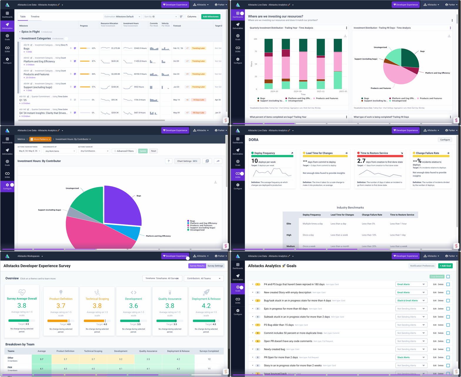
Software Engineering Intelligence
-
Intelligence Engine
On-demand exhaustive AI-analysis
-
Engineering Investment
Complete visibility into time & dollars spent
-
360º Insights
Create meaningful reports and dashboards
-
Project Forecasting
Track and forecast all deliverables
DevEx
-
Developer Surveys
Create and share developer surveys
Software Capitalization
-
R&D Capitalization Reporting
Align and track development costs
Building the New Allstacks Brand: A Design Process Stacked with Meaning
We are talking about the process of arriving at the new Allstacks brand and how important it was it represented some of the core values of our company and principles of our product.
In the spirit of our core value of transparency, we’re giving you a glimpse of what it took to ship the new look and build the layers of meaning behind it.
But first, why?
When we looked across the sea of blue of our industry, we knew we didn’t want to be lost amongst them. We wanted to signal that we are different and delivering a new experience. We consider our brand a promise about our product, people, and experience; so, a look that said “just like everyone else” wasn’t going to cut it. Our team agreed that we needed to craft a brand that captures the innovation, boldness, and thoughtfulness built into the Allstacks platform, services, and community. We develop uncommon relationships with our customers, and we needed a fresh way to express this in our brand.
Side note: A fun thing to know about our previous logo, our co-Founder and CEO, Hersh loves color, typography, and fonts. Our former logo was the product of him looking at a lot of fonts — the style of the lower case 'a' was very intentional. He then modified the kerning until it was just right. The colors were also inspired by the colors often seen in movie posters. This explains why so many companies choose blue and orange for their color palette.
Nurture friendships, not grudges.
It was important to us to have representatives from across the company involved in this process so they could have a sense of ownership by contributing their wishes for the brand, understand the why behind it, and ultimately how it impacts their teams and work. It was no surprise that we were all very aligned on our challenges and goals which allowed us to establish a plan and move quickly through this project. We agreed that we should develop the brand’s design, core messages, and persona in tandem, so we had strong continuity and meaning in every aspect of the brand. Our leadership team brought their team’s point of view, customer insights, and professional expertise to a series of brand development workshops with our creative partner WAXX.
This alignment is something we strive to model ourselves but also for our customers because it is a significant factor in meeting their collective business goals.
Together we defined a refreshed brand vision, outlining our ideal for the future of our industry. We crafted a new mission statement, reflecting how we plan to bring this vision to life by serving our customers. Additionally, we defined the traits and values that represent our brand, people, and customer community. We set out a strategy for folding all these qualities, values, and benefits into our messaging and visual identity.
- Vision: Building trust through software delivery.
- Mission: Put reliable predictive intelligence in technology leaders’ hands in order to foster trust between teams, give engineering a strategic voice in the boardroom, and deliver software with confidence.
- Brand Pillars: Discover insights, Align your organization, and Shape your outcomes.
True to our transparent and collaborative MO, design lead Matthew Congrove opened his process to the team, posting logo iterations to Figma and seeking feedback for inspiration and refinement. It wasn’t long before we landed on a design that seemed to say it all...pun very much intended.
Discovery. Visibility. Focus. Alignment.
As Matthew continued to play with the stacked A-frame logomark, we serendipitously noticed that the symbol looked like a beam of light from a flashlight. What an apt metaphor for a platform that illuminates data, opportunities, and insights while encouraging transparency across business functions. We liked that it represented discovery and exploration – both critical pieces of the product experience. Moreover, it provided an additional metaphor that drove home Allstacks' product value: bringing engineering effort into focus.
Photography buffs will know that poorly focused light appears as little orbs of color known as bokeh, pictured below. As you bring your scene into focus, the bokeh begins to take on a crisper shape more true to life. Mirroring this process, Matthew created transitional shapes within the logo, from a circle to a sharp triangle, to give the impression of bringing an object or outcome into focus. As our customers recognize, the layers of meaning packed into the new logo represent key product use cases that empower technology leaders to deliver software confidently.
Colors worthy of our customers
Part of redefining our image meant using color to better represent the boldness and creativity of our customers, along with the power of the product. We settled on purple as our primary brand color, creating a mood of luxury, wisdom, and magic to encapsulate the experience of using the Allstacks platform. We called upon grounding blue to capture trust and reliability, which are critical to our customers and the consumers of everything engineering teams deliver. Our blue hues also call to mind that “clear blue skies” feeling that comes with alignment and friendships across teams working together to build something great. Finally, a bright magenta alludes to the unexpected innovation that predictive intelligence can inspire.
Build trust. Deliver confidence.
Together, our refreshed design, renewed vision, and signature dedication to our customers say exactly what Allstacks is about: putting reliable predictive intelligence in technology leaders’ hands in order to foster trust between teams, give engineering a strategic voice in the boardroom, and deliver software with confidence.
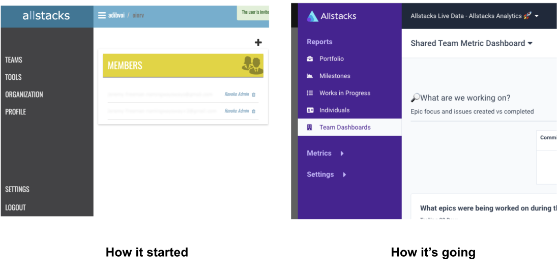
All this to say that we've come a long way...


